Have you ever wondered how to create a landing page with captivating content, which attract your customer as the magnet attracts iron, keep it glued to the monitor and release it only after it has performed the action YOU want?
Well! In this article you will be able to quench your thirst for knowledge.
In fact, we will examine a successful landing page that I created, and we will dismember it in all its parts.
The landing page that we will examine is the Home Page of the RisarcimentoMalasanita.net site.
Before starting, a small note to understand the market, this landing page was created for a law firm specialized in medical malpractice compensation .
A market in which I never wish you to enter, as a customer, but which is truly heterogeneous in age and gender.
We begin the examination of the landing page.
A landing page is the landing page of a campaign, which can take the form of:
- Squeeze page (page with the aim of obtaining contact details)
- of an e-commerce purchase page
- of article for the blog
- or even sales letter.
In this case we examine a Landing page in the form of a Sales Letter.
This is an important clarification, because each piece of Copywriting only makes sense if it is part of a broader web marketing strategy.
In this case, the strategy starts from a customer acquisition campaign through Adwords or SEO, which “hooks” the user while he is searching for keywords relevant to the sector, transports him to a sales letter that makes him feel in the right place from the very first lines and leads him to perform a contact request action.
Why was it chosen to create a sales letter and not another type of landing page?
Because Adwords and SEO are channels that intercept the CONSCIOUS QUESTION , that – to understand us – of people who are not wandering randomly on the web, but who are typing in search engines of search keys strictly related to the theme of the page.
They are people hungry (!!) of information because they are looking for the answer to a specific problem.
And given that the problem in this case burns a lot (they have suffered damage due to medical malpractice) it is highly probable that they can be immediately converted into contact requests.
Let’s start with the analysis of the landing page.
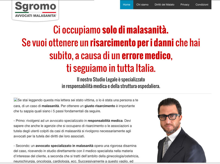
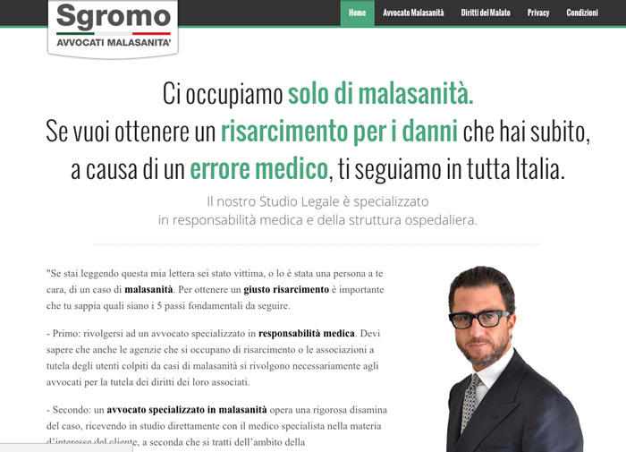
The first element we find is obviously the HEADLINE
The headline is the title of the landing page and its purpose is to attract the user’s attention.
In a headline that works, these 4 elements must never be missing, better if all 4 are present at the same time:
- the personal interest of the reader
- the news
- the curiosity
- the solution to a problem or the possibility of making a wish
You know when on the ring road, you find sudden traffic, a traffic jam that would seem inexplicable when looking at the horizon you realize that on the straight the road is empty and you ask yourself “how the hell is it possible that we are stopped if there is no one in front “? The explanation can be found when you arrive at a certain point you notice that on the other side of the roadway, in the opposite lane there is a bad accident and you understand that… ..you included…. At that moment you slowed down to see what happened.
Here the headline must be the accident in the other lane, it must CAPTURE ATTENTION!
In this case we find the personal interest of the reader and the Solution to a Problem (“If you want to obtain a fair compensation for damages due to a medical error, we will follow you throughout Italy”)
The possibilities to write a good headline are many.
Why was this chosen?
For those who search for the keywords relevant to the subject you will see appear numerous sites and ads sponsored by associations for the protection of patients and law firms, among other things, treat EVEN medical malpractice.
With this headline we want to emphasize the fact that the Sgromo studio specializes only in that , it does not deal with different types of lawsuits.
D elle short sentences, very direct, which go straight to the point highlighting the advantages, deepened later, to rely on this study as well as the difference compared to other law firms (e.g. the absence of legal fees until compensation is obtained).
In ABOVE THE FOLD (the first screen of the page that you can see without scrolling) you can also see 3 videos placed on the right column, which are intended to give authoritativeness to the Studio.
It is no coincidence that videos of television hosts (“Tempo e Denaro”), interviews with television journalists (Tiberio Timperi) and videos relating to the awarding of prizes to the Studio were generated, all generated by the “noise” that the results of the study obtained.
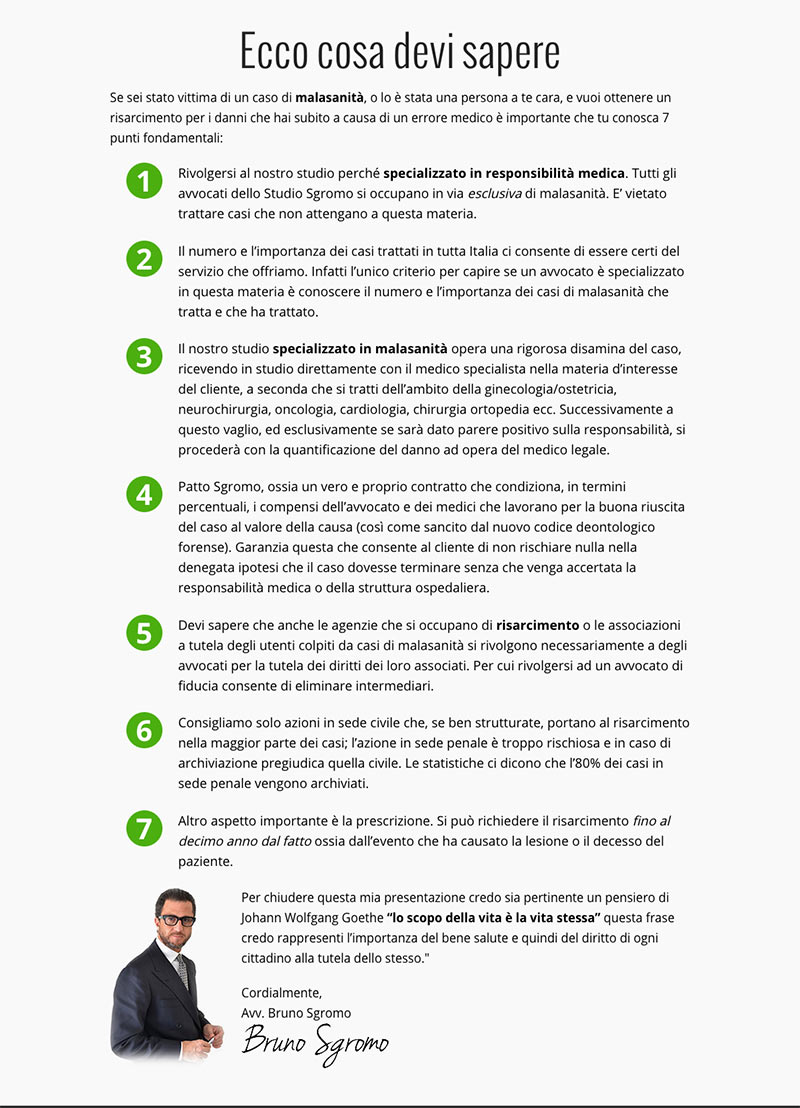
Continuing to scroll down, after the Bullets we find a piece of copy entitled “7 things you need to know” in which summarized valuable information for the user , which are still functional to the choice of the study.
The concepts that emerge from the reading are in fact:
- the importance of contacting a specialized studio
- the importance of verifying the number of cases treated by the study and their scope
- the procedure through which the study operates
- how the Sgromo agreement works (a kind of guarantee on the results for the user who relies on the study … we will talk about it later)
- why contact a specialized law firm rather than a guardianship association
- the need to act as soon as possible to avoid the prescription
Everything is signed with the photo and the signature of the lawyer Sgromo, to highlight the personal relationship with the user (for the series “I put my face on it”).
At this point the user may already have enough elements to perform an action. That’s why you don’t wait for the end of the page to give it a CALL TO ACTION, but you insert it already here (it will be repeated identically below).
This is a topical moment, in which the user is called to make a choice: click on the button to fill in the contact form or call the toll-free number.
Normally a contact form should consist of as few fields as possible, because with each additional field that you are asked to fill in , the conversion rate is reduced.
In this case, however, since these are highly delicate cases, in which the attention of the users is very high, because they have to solve a serious problem, after several tests we have managed to obtain a sufficient number of fields that still guarantee us today a high rate. of conversion.
A high percentage of users are influenced in their decisions by being able to talk to a real person. This tells us that a contact form is an excellent tool, but that it is wise to also support a telephone number, preferably a toll free number.
But what happens at this point if the user does not perform the action?
We need to continue building trust , but this time with something that gives incontrovertible proof of the authoritativeness of the study.
And what is better than a series of TESTIMONIES of solved cases, including a finished case on RAI1?
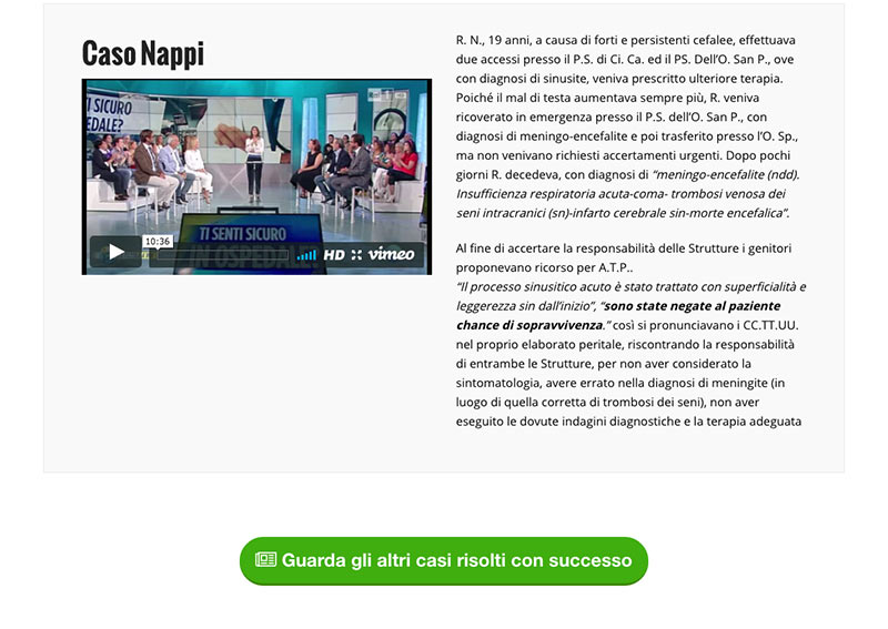
If you remember, one of the points of “7 Things you need to know” explicitly said that: “the only criterion to understand if a lawyer is specialized in this matter is to know the number and importance of medical malpractice cases he treats and has treaty “.
Here then by clicking on the green button to deepen the testimonials, you can scroll through a very long series of cases successfully solved , all in the specific sector.
Inserting testimonials is very important to “convince” the user to perform the action you want (in this case request a contact without obligation) because it allows you to take advantage of the mechanism of “social proof”.
Social proof is a psychological-social phenomenon on the basis of which we are led to consider something valid because others have considered it valid: for example we trust a law firm, because others before us have trusted it.
In business, testimonials are a powerful psychological lever to make the user feel more serene in making a decision, even more if they come from famous people, institutions or authorities.
Immediately after the testimonials and until the end of the landing page, pieces of copy are inserted that have the purpose of making the user perceive the simplicity and lack of risks that result from the decision to rely on the study.
Here are the messages that are passed:
- the studio will work at its best to get you compensation, because its remuneration also depends on that
- you will be provided with a specialist doctor in the field in which you suffered the damage
- you will not have to incur any expenses in case you do not get compensation
- you won’t have to do anything except hand over the documentation, because the studio will take care of everything
At this point, it is possible that the user is convinced of the importance of acting, but that he is skeptical about turning to a remote law firm.
And then it is necessary to DISASSEMBLE THE OBJECTION with a special copy piece:
“Choose your law firm for its specialization and not for where it resides”
The final part of the landing page informs the user on the procedure that the studio uses to ensure compensation in a short time that goes in stark contrast to what is the negative perception of the legal market (bureaucracy? = Biblical times!).
Now everything should be clear and the user should be ready for the CALL TO ACTION , which is proposed again at the bottom of the page.
Landing page history
Let’s take a dip into the past and let’s see for a moment what it was like and how this landing page became, as the results came, the authoritativeness of the study and of the site itself increased. Newspapers and media dealing with such cases approached the study by sending requests such as hosted televisions, local interviews, blogs that talk about the lawyer or the firm and so on. (If you are thinking of interviewing the lawyer Bruno Sgromo after this article, be it for a blog or anything else, contact me or send an email to [email protected]).
I take care of the online marketing of the Sgromo studio since March 2012, and as now many times it happens a continuous collaboration that lasts years.
For a practical matter, I only highlight the above the fold section here, otherwise the page would have been really kilometric.
– Start of everything in 2012 –
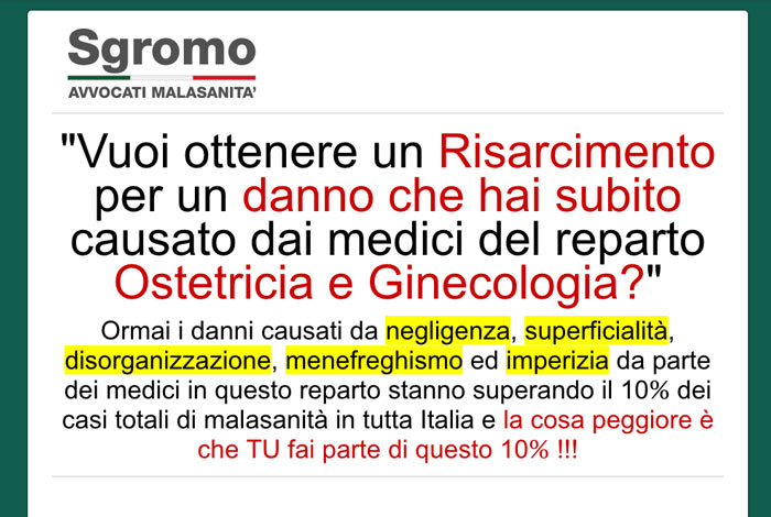
I was unable to recover the main landing,
which had the same structure as this which was super specialist for obstetrics and gynecology.
– First optimizations 2013 –
– How it changed in 2014 –
– How it changed in 2015 –
After a couple of meetings in which we went to discuss the changes, I
thought of putting the toll-free number first. This choice proved to be not very productive.
In fact, after a few weeks of testing and data collection, we took it off immediately.